OKUN NEEDS A BEVERIDGE
EDU DDA Jan. 7, 2025
Summary: November JOLTS was grim, everything beside job openings which, not surprisingly, everyone focused exclusively on. Hires way down, quits at a new low, layoffs on the rise. Worst of all, where the current JOLTS - including job openings - fits on the Beveridge Curve. This isn’t just an academic matter, the concept behind it will decide the biggest question of them all: where on the curve indicates which way the long run economic potential is most likely to be.

It isn’t just a question of recession in the US and therefore for most of the rest of the world (a lot of which is already stuck there, or heading headlong into one). Everything from short run to the longer-term is riding on the Beveridge Curve, at least the idea behind it. Are we at the flat part when unemployment begins to take over from the lack of hiring?
For the background on Dr. Beveridge’s curve and what it is supposed to signify, see my previous examination on the subject here.
At stake is more than a soft landing. If the American economy somehow managed to pull one off that would mean the country and maybe the world really could escape the pandemic, lockdowns, and supply shock (destroyed purchasing power) without having suffered a reduction in long run potential (the opposite from what happened after 2008).
Given what happened during the initial 2020s, that was always a longshot and therefore why markets have been pricing it that way from nearly the beginning, most of all anything fundamental and focused beyond the near-term (like swaps). As such, recession in that scenario would only be the means to that end, the transition between what’s left of the supply shock and that diminished potential.
The rest of the 2020s end up being too much like the 2010s.
With today’s release of November JOLTS by the BLS we can check in on where the labor market was a little over a month ago, and how that fits in (or doesn’t) with other data on the same topic with the intention of seeing where all of it fits into the idea illustrated by Beveridge.


To begin with, JOLTS job openings (JO). Mainstream fixation on this series is beyond frustrating given its plainly obvious flaws. Moreover, there has been report after report from a true variety of sources exposing them (dummy listings, employers using job ads as a corporate scorecard, double and ghost postings, etc.) You can just google them there are enough by this point.
So, it was more than frustrating to see November’s JO figure rebound for the second month in a row and climb back above 8 million, a meaningless result yet one which set the media on fire. Rising 700k from September’s low, this is being treated as proof of resilience if not strength in the economy when it is nothing of the sort. Setting aside the faulty data collection and processing, this kind of variation even to this degree in the short run is nothing new.
In August and September 2023, for example, job openings allegedly soared by a combined 500k which was like now declared proof of strength and resilience when, in fact, employment had already suffered a major shift (seen in even the QCEW) leading to rising unemployment through the shutdown of hiring (more on that in a minute).

And yet, we can still ignore all those and use JOLTS job openings anyway as a check on the labor market anyway. Since it presents the absolutely maximum optimistic picture of labor demand, it’s therefore a highly conservative measure. The Beveridge Curve employs (pun intended) the JOLTS version as one half with the unemployment rate as the other (another one which is heavily skewed to the positive due to the participation problem; more on this below, too).
When using the JO data or adjusting it modestly (by 1 million) trying to account for some of its overstatement, the latest data for the past several months keeps putting the current economy right at that critical threshold, the crossroads where the vertical part of Beveridge eventually gives way to the flattening where no economy ever wants to be.
The November JO estimate (either as-is or adjusted) actually does nothing to change that, with these months clustered right in that same general area at the point of inflection, the real danger zone contrary to how job openings are currently being characterized.
However, adjusting first for JO then also comparing that to the adjusted unemployment rate which does try to account for recent cyclical labor force dropouts, these comparisons even more strongly indicate being past the inflection – that demand for workers has slowed and dropped more than enough that employers haven’t just stopped hiring they’re now more actively firing.


Even if that is too many adjustments for your taste, the unadjusted curves are already in that vicinity to begin with. The only question is how far into that territory the labor market may have gone by November.
The hiring and quits data from the latest JOLTS are in that same theoretical place already, no need for any alterations or further manipulations. Hiring fell back yet again to nearly match the shocking June low and, outside of September (like CES), has remained in the toilet all summer into fall (so, no, October weakness really was not storms/strike).
As discussed here in this previous DDA, there has been a solid, historical relationship between the hiring rate and LF participation. Even more intuitive than the Beveridge Curve, simply put, when not enough hiring takes place workers drop out of the labor force after giving up looking for jobs they know aren’t available.


The LF participation rate plateaus then falls once hiring diminishes beyond a threshold. Sure enough, that’s exactly what we find from last year (just after that one two-month surge in job openings) on through the final months of this year. Hiring began to slow down dangerously, and as the number of unemployed began to pile up, because of no hiring the participation rate topped out for the cycle then began declining in 2024.
And with hiring far weaker the past two months, October and November, sure enough the labor force shrank sharply (with employment in the HH Survey) in both of those.
At this point I’m only attempting to account for the cyclical aspects to the participation problem, meaning the current downswing in the labor market. There is still leftover structural “slack” in the labor force which dates back now more than sixteen years to the meltdown in 2008. Even so, it’s already significantly correlated with hiring, enough to back up the contention on the Beveridge Curve that either the labor market is very near or already beyond the inflection.
We can make another comparison to strengthen that point still further. The hiring data from JOLTS also corresponds closely with the unadjusted (by me) number of officially unemployed. Those two line up relatively closely throughout the nearly twenty-five-year run of the former.

What the latest data shows is that as the level of hiring has decreased unemployment is rising probably even more than the BLS numbers suggest – instead, the low level of hires would propose a level of unemployed much closer to my own adjusted unemployment rate which adds back those cyclical LF dropouts. Again, consistent with the idea behind the Beveridge Curve where demand for labor (in this case, hiring) weakens enough employers are no longer simply refraining from adding more workers they’re actively reducing theirs.
As far as firing goes, the JOLTS data does itself point to a modest yet noticeable upward trend in layoffs. Not only that, this dates back to April 2024 exactly the same potential inflection as seen around the entire macro world not just in the United States. Private layoffs have more clearly been rising and, more importantly, they’ve been doing so as more than a temporary fluctuation or variation.
The BLS had revised up October’s estimate for layoffs (and discharges) by over 100k and then sees November going even higher to come in just behind September’s sharp rise. These rising numbers aren’t huge and in historical context they’re still small, which puts them on the fence between the Beveridge Curve’s flat and vertical sections.


Vertical is just a slowdown or, in the case of the past few years of coming off the supply shock, normalization. A few more sustained layoffs like we see here in JOLTs could be nothing more than the labor market coming back from its (artificial) high and getting back into the more sustainable balance where firing becomes more common relative to 2021-23, more like the 2010s.
That’s why discerning the spot on the Beveridge Curve is so important. There’s a vast distance in potential outcomes between very small differences in location on it.
There’s also the last part of JOLTS – quits. The November quit rate set a new cycle low roughly equal to 2015 (not a good sign) or May 2008 right before the labor market fell off that cliff. American workers know there aren’t any jobs so they are staying put, adding another perspective on the same question and answering like everything else here with more weakness beyond strictly normalization.
Quits are also making a definitive move toward the territory covered by the flat part of the Beveridge Curve, too.


Beside Beveridge, Economists often cite another relationship - Arthur Melvin Okun’s “law.” In addition to being a well-known Economist who once chaired LBJ’s Council of Economic Advisors, Art, as he was called, came up with a connection between changes in output and changes in employment (or unemployment, inversely).
Intuitively like Beveridge, it stands to reason that if output is growing unemployment would be falling (or employment rising). Okun is most often measured by variations GDP versus shift in the unemployment rate where the shorthand is frequently given as a 3% change in GDP translates into a 1 percentage point drop in the unemployment rate (there are different calculations and estimates).
What that also means, looking at if from the other direction, if we found a 1% increase in the unemployment rate that should approximately correspond to a 3% decline in GDP (or however output might be presented).
There used to be a solid enough correlation between the unemployment rate and GDP, as seen here:

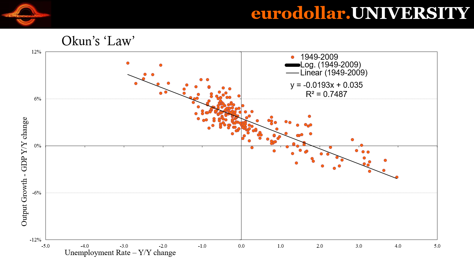
However, you can see that relationship was greatly diminished (like so many others) following the Great not-Recession (because it wasn’t a recession). The R-squared for the entire history 1949 to 2024 is 0.6338, yet it rises to nearly 0.75 when including only the years 1949 to 2008.
For the 2010s, there was practically zero co-movements between GDP and the unemployment rate (R-squared a laughable 0.0205). Output was rising to where unemployment should have been declining far faster than it did (a problem the Federal Reserve frequently complained about, yet like Einstein’s version of insanity kept doing the same things and expecting this to suddenly produce different results).
The relationship actually did come back if only briefly during the pandemic/lockdowns and then the supply shock. R-squared for 2010-24 when including 2020-22 goes up to 0.773, then drops back to basically no relationship without those years. Why Okun has behaved or misbehaved, really, is beyond our purpose here.


My point is that the fact GDP has help up throughout the past two years does nothing to counter the labor market weakness shown by the unemployment rate, JOLTS, or anything else in this examination up to and including the possible Beveridge inflection. If this was instead anytime from 1949 to the nineties when Okun was stronger, then the rising unemployment rate and severe slowdown in hiring might be in conflict with GDP.
Since there has been little relationship between them since 2008, however, the one has nothing to say about the other.
One final note on JOLTS: calculating the actual labor turnover for the past two months (which mercifully does not include job openings) yields some surprisingly weak results, particularly when reconciled with the Establishment Survey. Start with hires and subtract quits and layoffs, then adjust by a constant factor (350k) and that net turnover should and regularly does come in close to whichever month’s payroll estimate.
For October and November, the net turnover from JOLTS was exceptionally puny, the equivalent of 13k for the former month and just 89k in the latter. CES was close in October at (revised) 36k but then jumped to 227k for November. This means the JOLTS and its very dim hiring, really low quits, and modestly rising layoffs was weak in both months like CPS data was.


Even JOLTS – which is benchmarked to CES – says October weakness was not storms and strike since it also continued in November the same as CPS had.
There isn’t any conclusive number or set of them which definitively declares the labor market having already moved to the wrong part of the Beveridge Curve. That never happens anyway. Instead, the weight of evidence has been indicating the labor market moving into if not past the inflection point. November JOLTS adds more and stronger to that side.
If that proves to be the case, the implications go way beyond the cyclical recession question on into the long run potential and a whole lot more beside. Whereas practically everyone in the mainstream has given up entirely on the idea of anything other than a soft landing yet another time (it should be noted how “conventional wisdom” has swung back and forth several times the past year and a half while the data itself never has), anyone truly data dependent would have to see it very differently.
Whatever Friday’s December CES payrolls might end up being.